plotly를 이용해서 candle 차트를 그리고 거래량 이동평균 데이터도 같이 확인해 보겠습니다.
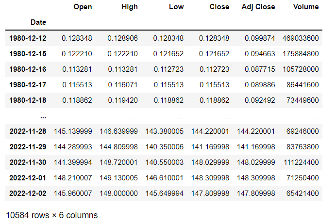
candle 차트에 사용할 데이터는 apple 주가로 하겠습니다.
financedatareader를 이용해서 불러옵니다.
import FinanceDataReader as fdr

df=fdr.DataReader('AAPL')
df
1980-12-12부터의 데이터가 확인이 되네요.
그럼 candle 차트를 그려보겠습니다.
x축의 날짜 데이터와 open, high, low, close의 정보를 각각 지정해줍니다.
import plotly.graph_objects as go

fig = go.Figure(data=[go.Candlestick(x=df.index,
                open=df['Open'],
                high=df['High'],
                low=df['Low'],
                close=df['Close'])])

fig.show()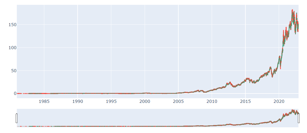
plotly에서는 차트에서 원하는 구간만 확인이 가능합니다.
마우스 왼쪽 버튼을 누른채로 드래그를 하면 그 기간의 데이터만 확대해서 보입니다.
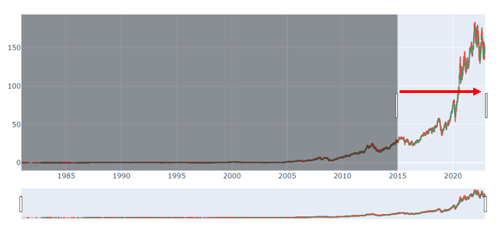
확대된 그래프 입니다.
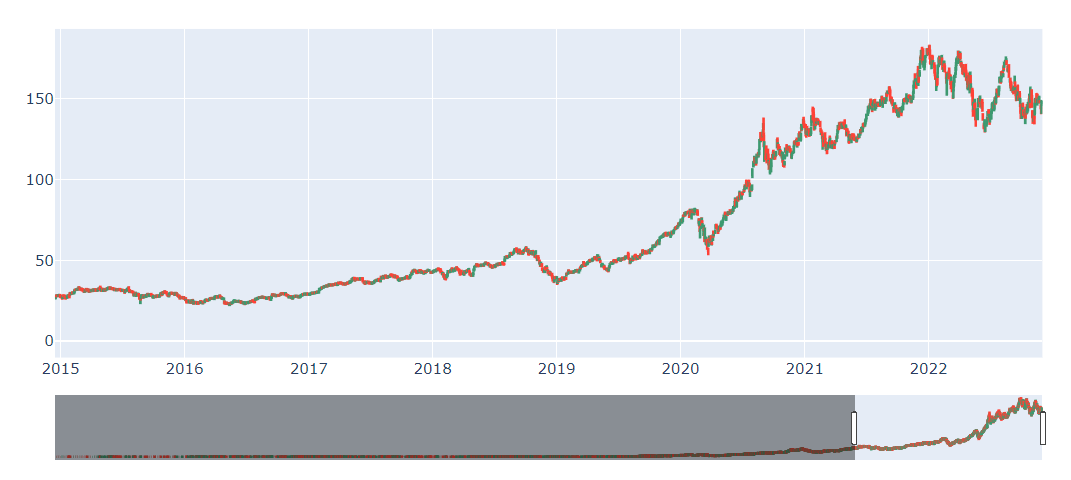
데이터의 기간을 2022-01-01부터로 축소하고, 그래프의 색을 변경하겠습니다.
그래프는 상승 시 빨간색, 하락 시 파란색으로 변경하겠습니다.
increasing_line_color= 'red', decreasing_line_color= 'blue'을 추가하면 됩니다.
fig = go.Figure(data=[go.Candlestick(x=df.index,
                open=df['Open'],
                high=df['High'],
                low=df['Low'],
                close=df['Close'],
                increasing_line_color= 'red', decreasing_line_color= 'blue',
                )],)

fig.show()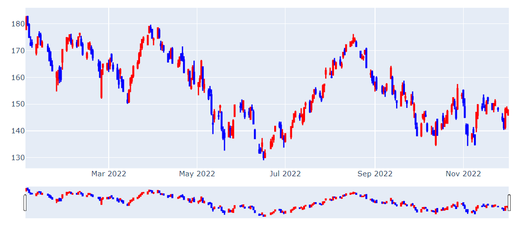
다음은 주가 데이터에 거래량 데이트를 추가해보겠습니다.
candle 차트를 row=1, col=1에 거래량을 row=2, col=1에 지정했습니다.
from plotly.subplots import make_subplots

fig = make_subplots(rows=2,
                    cols=1,
                    shared_xaxes=True,
                    )

fig = make_subplots(rows=2, cols=1)

fig.add_trace(
     go.Candlestick(x=df.index,
                open=df['Open'],
                high=df['High'],
                low=df['Low'],
                close=df['Close'],
                increasing_line_color= 'red', decreasing_line_color= 'blue',
                name='주가'
                ),
                row=1, col=1
)

fig.add_trace(
    go.Bar(x=df.index, y=df['Volume'],
           name='거래량'),
    row=2, col=1
)

fig.update(layout_xaxis_rangeslider_visible=False)

fig.show()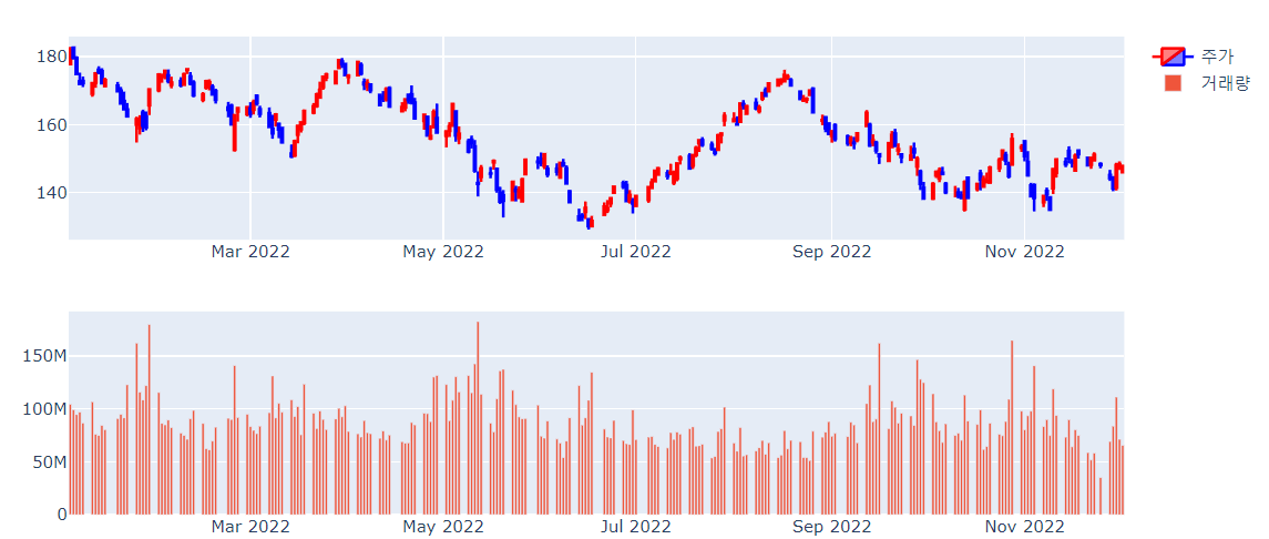
거래량 그래프가 나왔습니다.
거래량도 주가 상승한 날과 하락한 날을 종가-시가를 기준으로 데이터를 구분하는 column을 추가합니다.
df['change']=df['Close']-df['Open']
df.loc[df['change']>=0,'Volumecolor']=1
df.loc[df['change']<0,'Volumecolor']=0
df[['change','Volumecolor']]
marker=dict(color=df['Volumecolor'],colorscale='BlueRed'), 이 부분을 추가해서 상승한 날의 거래량은 빨간색으로 하락한 날은 파란색으로 보이게 했습니다.
from plotly.subplots import make_subplots

fig = make_subplots(rows=2,
                    cols=1,
                    shared_xaxes=True,
                    )

fig = make_subplots(rows=2, cols=1)

fig.add_trace(
     go.Candlestick(x=df.index,
                open=df['Open'],
                high=df['High'],
                low=df['Low'],
                close=df['Close'],
                increasing_line_color= 'red', decreasing_line_color= 'blue',
                name='주가'
                ),
                row=1, col=1
)

fig.add_trace(
    go.Bar(x=df.index, y=df['Volume'],
           marker=dict(color=df['Volumecolor'],colorscale='BlueRed'),
           name='거래량'),
    row=2, col=1
)

fig.update(layout_xaxis_rangeslider_visible=False)

fig.show()
봐오던 주가 차트와 얼추 비슷하게 된 것 같습니다.
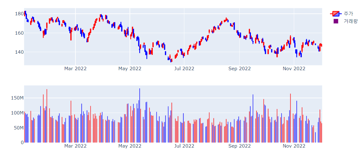
다음으로는 이동 평균 데이터를 추가해보겠습니다.
DataFrame의 rolling을 이용하면 됩니다.
5일, 10일, 20일, 60일 120일 데이터를 추가하겠습니다.
df['ma5']=df['Close'].rolling(5).mean()
df['ma10']=df['Close'].rolling(10).mean()
df['ma20']=df['Close'].rolling(20).mean()
df['ma60']=df['Close'].rolling(60).mean()
df['ma120']=df['Close'].rolling(120).mean()
df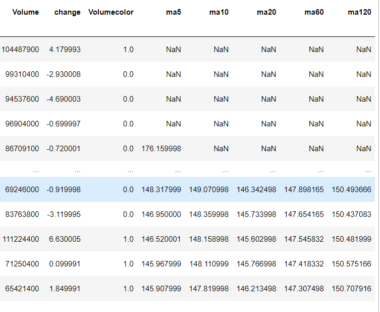
각 이동평균마다 line 그래프를 추가하겠습니다.
from plotly.subplots import make_subplots
fig = make_subplots(rows=2,
cols=1,
shared_xaxes=True,
vertical_spacing=0.1)
fig = make_subplots(rows=2, cols=1)
fig.add_trace(
go.Candlestick(x=df.index,
open=df['Open'],
high=df['High'],
low=df['Low'],
close=df['Close'],
increasing_line_color= 'red', decreasing_line_color= 'blue',
name='주가'
),
row=1, col=1
)
fig.add_trace(
go.Scatter(x=df.index, y=df['ma5'],
line=dict(color="#b66aa0"),
name='MA5'),
row=1, col=1
)
fig.add_trace(
go.Scatter(x=df.index, y=df['ma10'],
line=dict(color="#414b73"),
name='MA10'),
row=1, col=1
)
fig.add_trace(
go.Scatter(x=df.index, y=df['ma20'],
line=dict(color="#e8d887"),
name='MA20'),
row=1, col=1
)
fig.add_trace(
go.Scatter(x=df.index, y=df['ma60'],
line=dict(color="#73ad8a"),
name='MA60'),
row=1, col=1
)
fig.add_trace(
go.Scatter(x=df.index, y=df['ma120'],
line=dict(color="#8b8b8b"),
name='MA120'),
row=1, col=1
)
fig.add_trace(
go.Bar(x=df.index, y=df['Volume'],
marker=dict(color=df['Volumecolor'],colorscale='BlueRed'),
name='거래량'),
row=2, col=1
)
fig.update(layout_xaxis_rangeslider_visible=False)
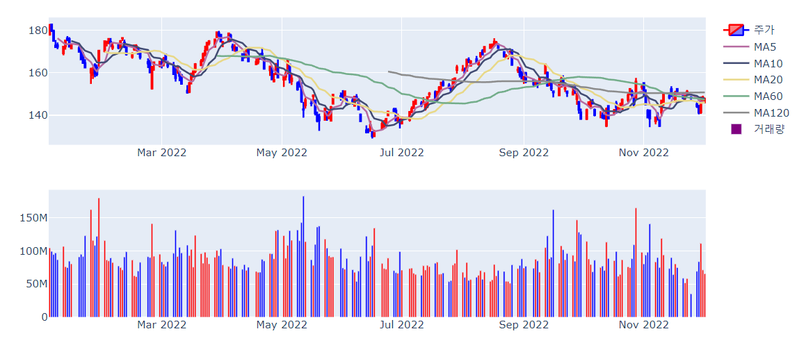
fig.show()이동평균까지 그래프에 추가가 됐습니다.
plotly를 이용해서 candle 차트를 그리고 거래량 이동평균 데이터도 같이 확인해 봤습니다.
'코딩TIPS' 카테고리의 다른 글
| [Python] Dataframe 날짜 더하기(dateoffset) (4) | 2022.12.22 |
|---|---|
| [plotly]pie 그래프 그리기 (4) | 2022.12.19 |
| [plotly] 이중 축, 2 axis 그래프 그리기 (8) | 2022.11.25 |
| [plotly] color_discrete_sequence (color palette 변경) (4) | 2022.11.17 |
| [plotly] color_continuous_scale (color palette 변경) (8) | 2022.11.16 |


